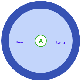
You can customize the C1RadialMenu's appearance using either ClearStyle technology or by adding an icon to a C1RadialMenuItem. Customizing your menu control, either by changing the appearance or by adding an icon, can be done quickly and easily.
Customizing the C1RadialMenu's appearance uses just a few properties.
Complete the following steps:
- Add the following properties to the <Xaml: C1RadialMenu>tag:
- AccentBrush="#FF28B01A"
- Background="#FFC3D5FB"
- BorderBrush="#FF3652B4"
- Foreground="#FF4210EE"
- Run your application.
When you run your application, it should resemble the following image:
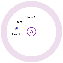
Adding an icon to a C1RadialMenuItem can be completed in just a few steps.
Complete the following steps:
- Add an icon image to your project. A 12x12 pixel image is best.
- Add the following XAML markup between the <Xaml:C1RadialMenuItem> and </Xaml:C1RadialMenuItem> tags, replacing the value of the Source property with your image's name:
XAML <Xaml:C1RadialMenuItem.Icon> <Image Source="YourImage.png" Height="12" Width="12" Margin="5,0,0,0"/> </Xaml:C1RadialMenuItem.Icon>
- Run the project. The following image depicts a C1RadialMenuItem with a 12x12 pixel icon.